// the challenge
Lake Tahoe's climate story was scattered across agencies, reports, and spreadsheets: greenhouse gas inventories in one place, lake temperature records in another, forest and wildfire data somewhere else. There was no single, current, public view of how the basin is doing against its climate goals, and no maintainable way to keep one up to date.
// the approach
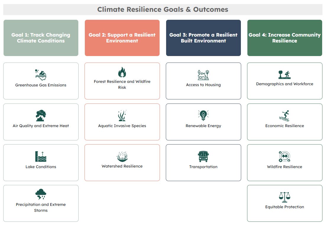
I designed the dashboard around TRPA's four climate resilience goals: tracking changing climate conditions, supporting a resilient environment, promoting a resilient built environment, and increasing community resilience. Each of the 33 indicators became its own self-contained, embeddable chart page, so a single visualization can live both inside the dashboard and be dropped into any CMS page or report.
Charts are built with Plotly.js for interactive, accessible visualizations, fed by Python data pipelines that pull from TRPA's databases and partner sources, transform the records, and publish clean series the front end consumes. Decoupling the data layer from the presentation layer means an indicator updates everywhere it appears the moment its pipeline runs.
// the outcome
The result is a living platform: 33 indicators across 4 goals, browsable by the public and used by agency staff to communicate progress. Because every chart is embeddable and every dataset is pipeline-driven, the dashboard stays current with minimal hand maintenance, and new indicators slot into the same framework.